NaNa Cafe
ReBranding, Brand Consistency, Concept and Content Design, Exterior Design
Including: New logo, Colour palette, Updated uniforms, Menu Design (Content and Visuals), The Exterior Space, Printed Elements.

About the Project
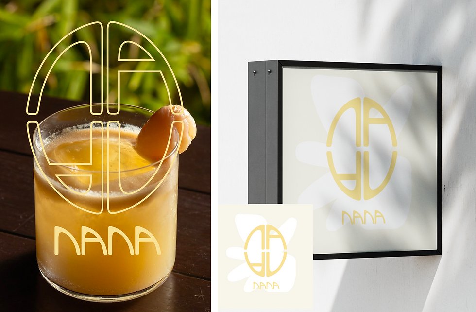
Nana Cafe has always embraced a Mediterranean concept, but its previous brand design failed to fully capture or communicate this identity. The old branding relied on a gold logo over a brown background, with dark navy and brown uniforms. Safe but unclear choices that didn’t reflect a strong narrative or target audience. As someone who has lived along the Mediterranean coast, I approached this rebranding project with a personal connection and a deep understanding of the region’s atmosphere. I began by redesigning the logo to be more minimal and versatile, making it easier to apply across both print and digital formats. To convey the relaxed, simple, yet joyful essence of the Mediterranean, I created a custom, bold, and fluid typeface exclusively for the logo. Free of harsh edges to reflect a softer, more welcoming feel.
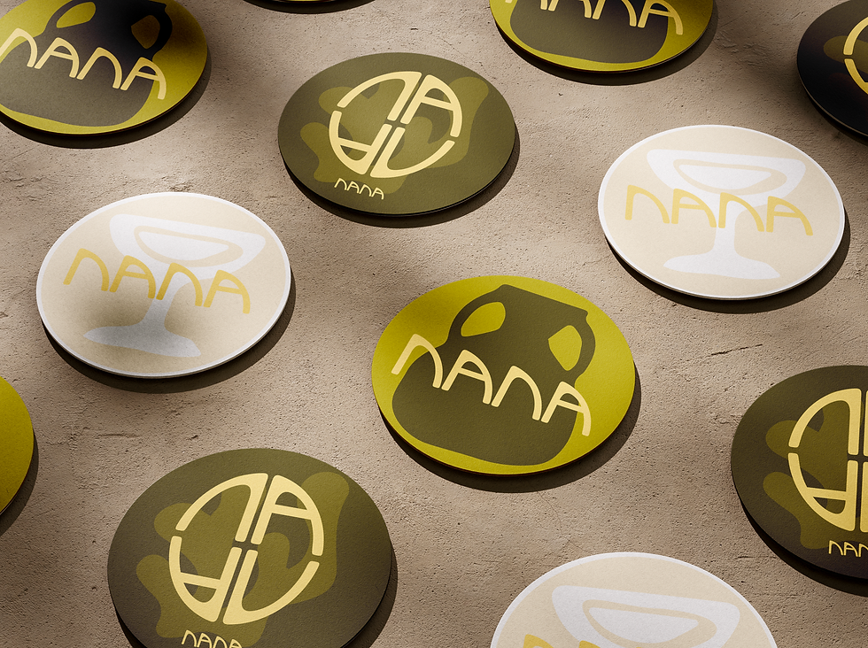
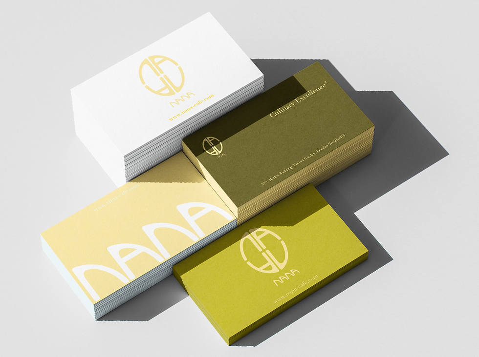
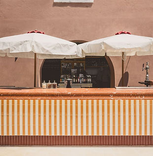
For the colour palette, I chose a light yellow inspired by Mediterranean lemons and citrus fruits, paired with a deep green that could also be used in winter. This green not only echoes the meaning of “Nana” (mint tea) but also evokes the color of olive trees, tying it beautifully to the olive branches we used in the café’s exterior design. The deep green also complements the greenery of Covent Garden. We replaced black with white to keep the brand feeling fresh, elegant, and airy, especially when combined with yellow. Uniforms were redesigned in crisp white and soft “butter yellow,” while the café’s cushions were matched in yellow and the exterior enriched with lush green plants. Every element was thoughtfully chosen to bring the Mediterranean spirit to life in an authentic, modern way.
Logo & Colour Palette


Ideation

Application


Look & Feel


